 When communicating complex information or instructions to a global audience, graphics can convey the message quickly and clearly. Sometimes, though, words are necessary in illustrations. When documents get translated to a target market, those words need to be translated as well. Sometimes it is the images themselves that need to be localized to avoid confusion. Translation is the process of changing text from one language to another.
Localization is the adaptation of a product or service to meet the needs of a particular language or region. Planning for document translation while creating the source material can help avoid complications and save time and money during the localization process.
Translating text in illustrations
Translating documents opens up new markets and reaches new audiences. There is no doubt that translating source material, be it marketing or technical, produces results. Questions often arise around translating the text in graphics, though. Depending on how the graphics were originally created can determine if translating text in the graphics will be a simple task or a more challenging, and expensive, one.
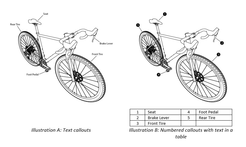
Some graphics benefit from having some text or callouts to identify specific items. There are a few methods to do this, and each will affect the translation process. A common way to add text to an illustration is to add it directly in the artwork (refer to Illustration A). There is software your translation provider can use to extract the text for the translator.
As long as the native (editable) artwork remains available, the text can be changed from your source to the translated text with relative ease. One thing to keep in mind, though, is many languages use more characters or words than English, so callouts can use more space on the page. A complex illustration with many callouts can prove challenging when limited space is available.
Another option is to use numbers in the artwork and add a callout table following the art (refer to Illustration B). Most languages understand numeric characters, so the step of editing the art is not necessary. This can be especially useful when the native files are not available, or when translating a document into several languages, as it eliminates the need to fit the text in the space available.
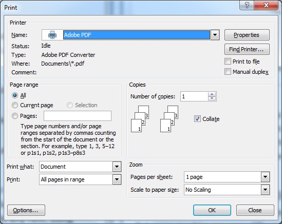
 Another type of illustration that may require translation is a screen capture. Screen captures are images of user interface components such as a dialog box or menu. If the software is to remain in English, a translator can ensure the text in the manual reflects English screen text, commonly called “strings”. A common practice is to include the English text found on the screen with a translation of the meaning of that text following it in parenthesis. As an example, text referring to the screen below in the English manual may say, “Select Current page”. Once translated, the French text would read, « Sélectionner Current Page (Page courante) ».
If the software is available in other languages, images of each screen will need to be captured so the translator can accurately translate text to match the screens. If software screens need to be translated, it is best practice to translate the screen “strings” before translating the associated manual. This gives the linguist(s) an opportunity to learn the software and know how the text will appear on-screen, so when translating the manual, the translated text can match the translated screen text. This will avoid text revision and user confusion.

Localizing illustrations
There are many graphics that are internationally recognized; the No Smoking symbol is one such image. But many graphics can carry different meanings depending on the region. The South African Chamber of Mines needed to address health and safety issues for their employees. Most were illiterate, so the decision was made to give instructions using graphics. One such image was that shown below, the purpose of which was to keep mine tracks clear.

The result was not as expected, though. The tracks became blocked. Why? The miners were reading the graphic from right to left.
Colors have different symbolic meanings from culture to culture. In the graphic below, green represents hope in most parts of the world, but red has very different meanings. This does not mean color should be avoided in documents, but its use should be researched and used carefully.

Care should also be taken when using human representations, or parts of the human figure such as hands or feet. Some cultures are sensitive to this, others use a specific set of protocols to define how the human figure is portrayed. The human figure or specifically hands can be useful alongside objects to illustrate a procedure or a safety concern, but it is best to use gender neutral, simple shapes of the human figure. Both ANSI and ISO are sets of standards that provide internationally recognized safety icons. Each group has taken the time to test the icons internationally to ensure cultural sensitivity.
These are a few examples where cultural differences can impact the simplest things in a graphic. A cultural review by a localization partner examines how a target market interprets an image. In the mining graphic example, the instructions were not interpreted as intended. Other graphics might be seen as offensive, sacred, or otherwise inappropriate. Regardless of how the graphic is perceived, the message is not received, and that is a problem.
Conclusion
There is no doubt that providing well-translated documents enhances a business’ image in the global marketplace. A part of ensuring an outstanding customer experience includes providing images that are culturally appropriate. There are a few potential concerns when preparing illustrations for international use, though. Making smart choices early in the document creation process can reduce translation and localization costs, and provide the end user with information that is both easy to understand and culturally sensitive.
Written by Cindy F. Jackson, Document Engineer at CPG Documentation, LLC www.cpgcanhelp.com
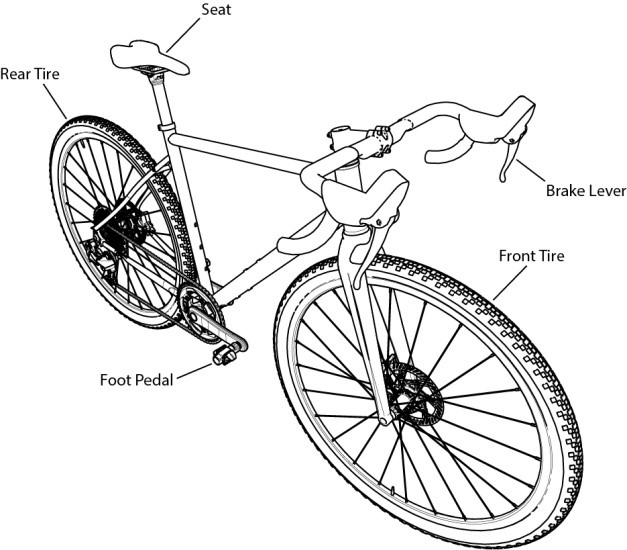
Original bicycle drawing and rendering produced by M. Morozov, downloaded from GrabCAD.com.
Everything You Need To Know About Graphic Localization, http://www.argosmultilingual.com/blog/everything-you-need-to-know-about-graphic-localization
What You Need To Know About Graphic Localization, https://www.globalizationpartners.com/2010/06/03/what-you-need-to-know-about-graphic-localization/
Graphics & Images: Localization and Cultural Differences, https://www.kwintessential.co.uk/resources/graphics-images-localization-and-cultural-differences
Colour and Cultural Design Considerations, https://coloursandmaterials.wordpress.com/2014/11/07/colour-and-cultural-design-considerations/

